CSEO Studio
CSEO needed a toolkit to drive coherence across the internal tools pivotal to Microsoft’s success

Core Services Engineering & Operations (CSEO) handles the creation and support of internal applications in the Sales, HR, Smart Campus and Financial space at Microsoft. Traditionally, visual and UX design hasn’t played a major role in the process of designing these applications. As a result, many of these tools are not user friendly, lack a similar look/feel and function entirely differently from one another. As a member of the Coherence team, my first task was to create a formal Figma toolkit that could be easily understood by designers, devs and PMs with the goal of establishing consistent guidelines around design best practices. Figma is the tool we use across the studio to create designs from start to finish. These design best practices would ensure CSEO creates applications moving forward with polish and best-in-class fundamentals at top of mind.
Project
Design system, UX, Layout
Year
2019
There were multiple steps involved in the creation of the CSEO Coherence toolkit. The first step was to develop a system by which components should be organized within Figma so they are easily accessible across CSEO. The second step was to create guidance along with visuals and examples that demonstrated how these components should be used. The third step was to educate other designers how to create guidance of their own and follow our templated process so that when designers within say the Sales space needed guidance around a specific component that was specialized to their area, they could replicate our system rather than forcing all future components to flow through the Coherence team’s pipeline.
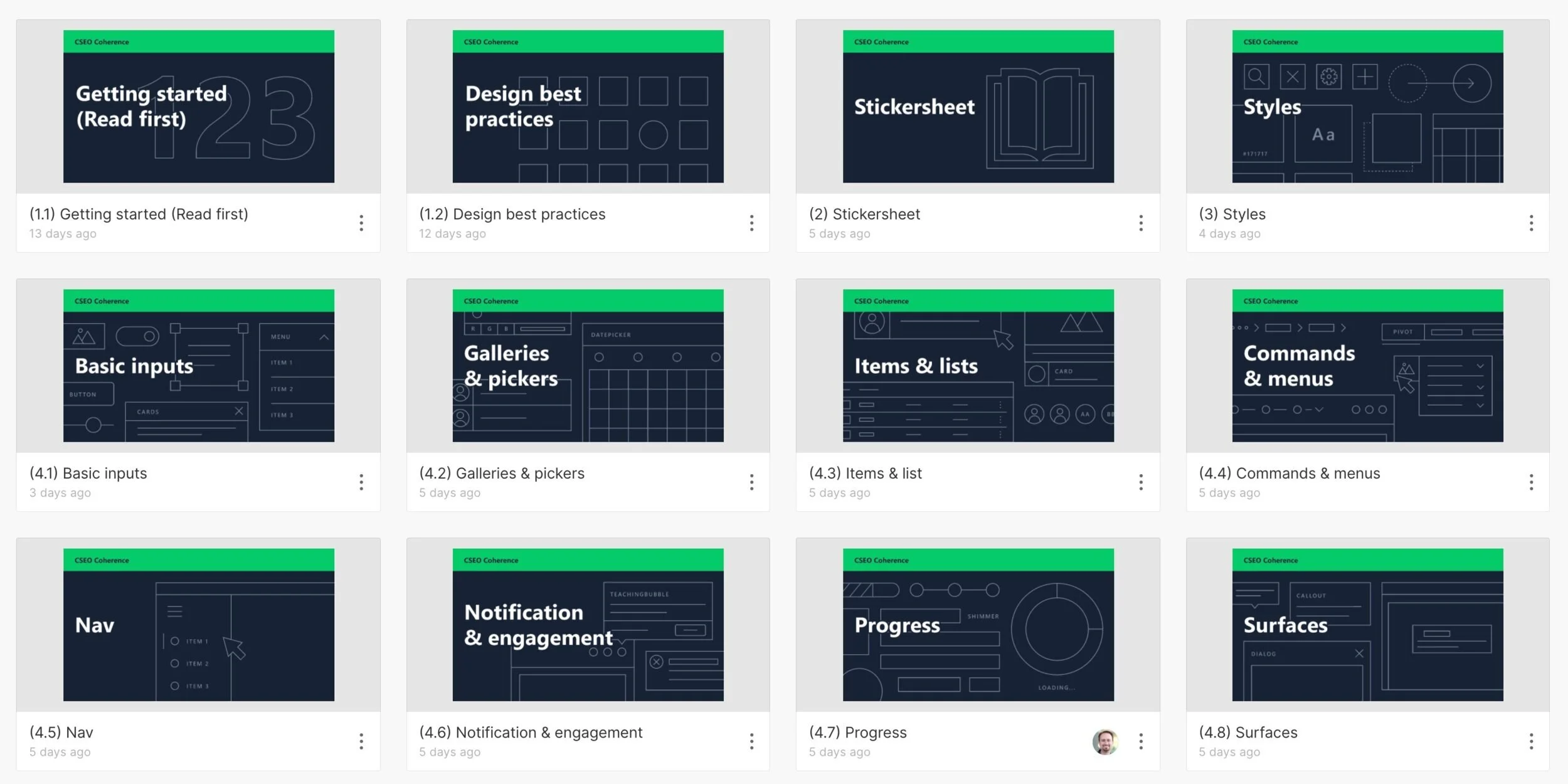
Multiple Figma files contain multiple components. Because our toolkit exists within Figma, designer A can take components directly from a Figma file and use them in their specific files. When these components are updated on our end, the components taken from the toolkit originally by designer A automatically updates in their file.
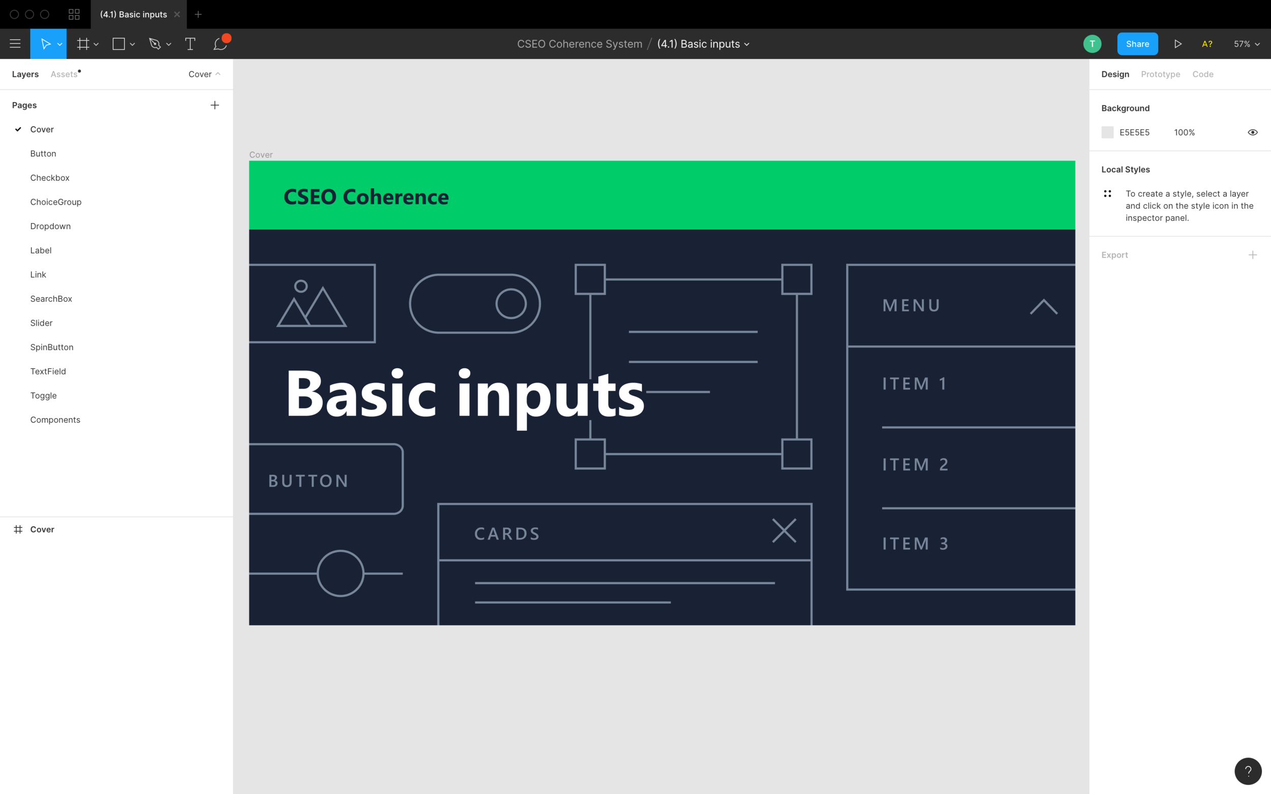
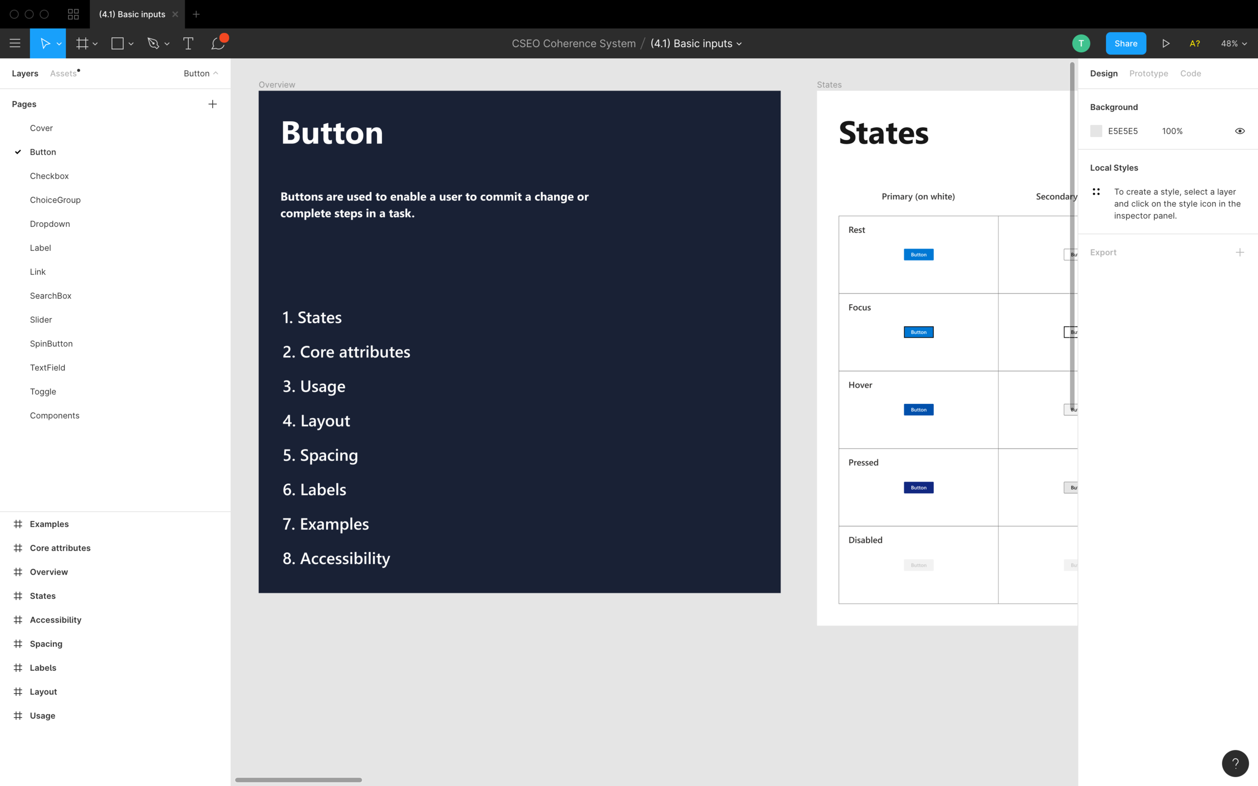
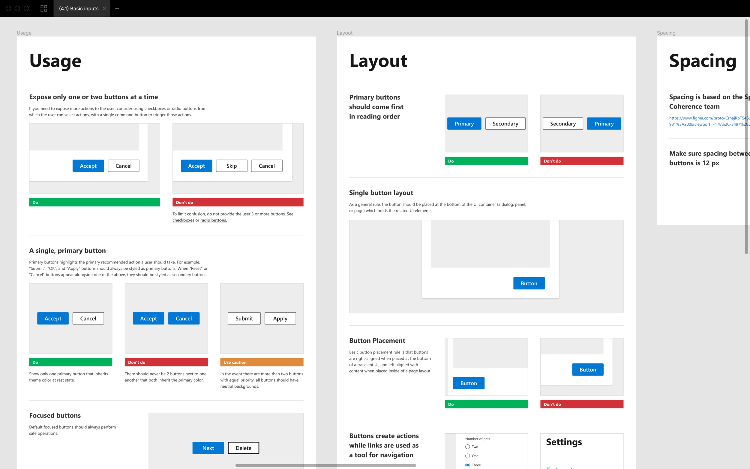
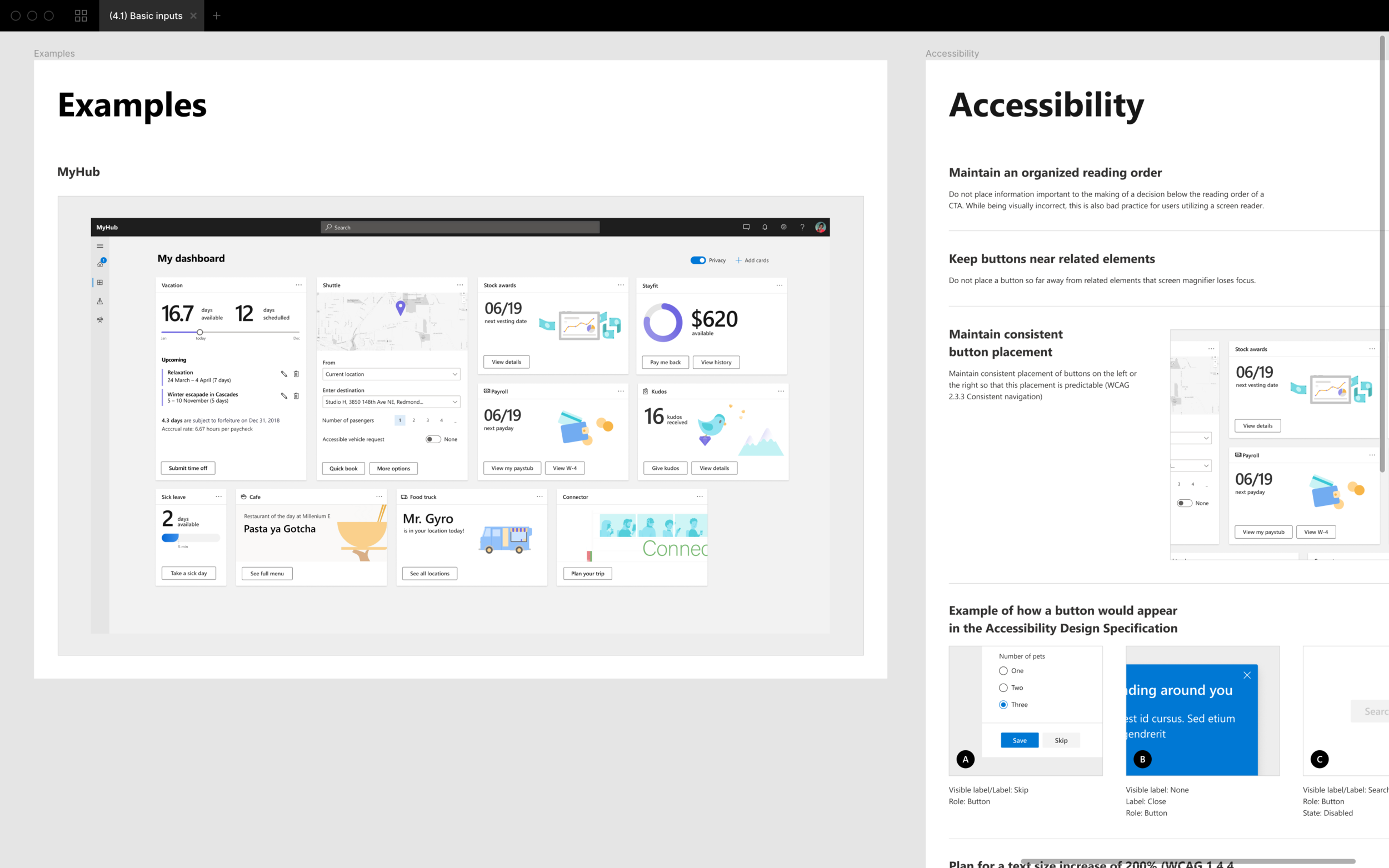
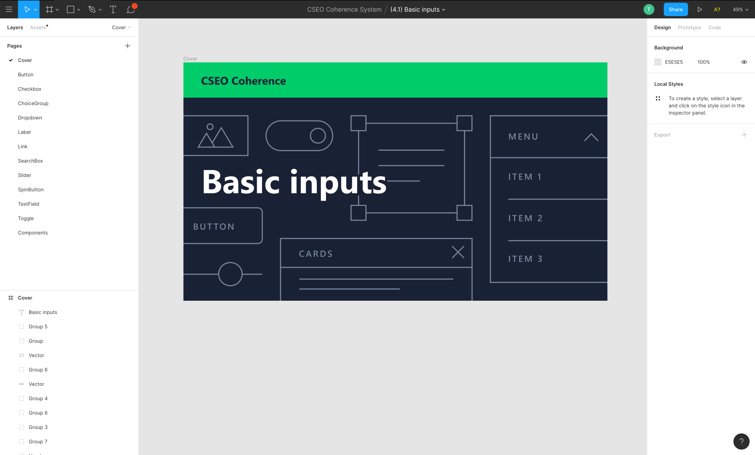
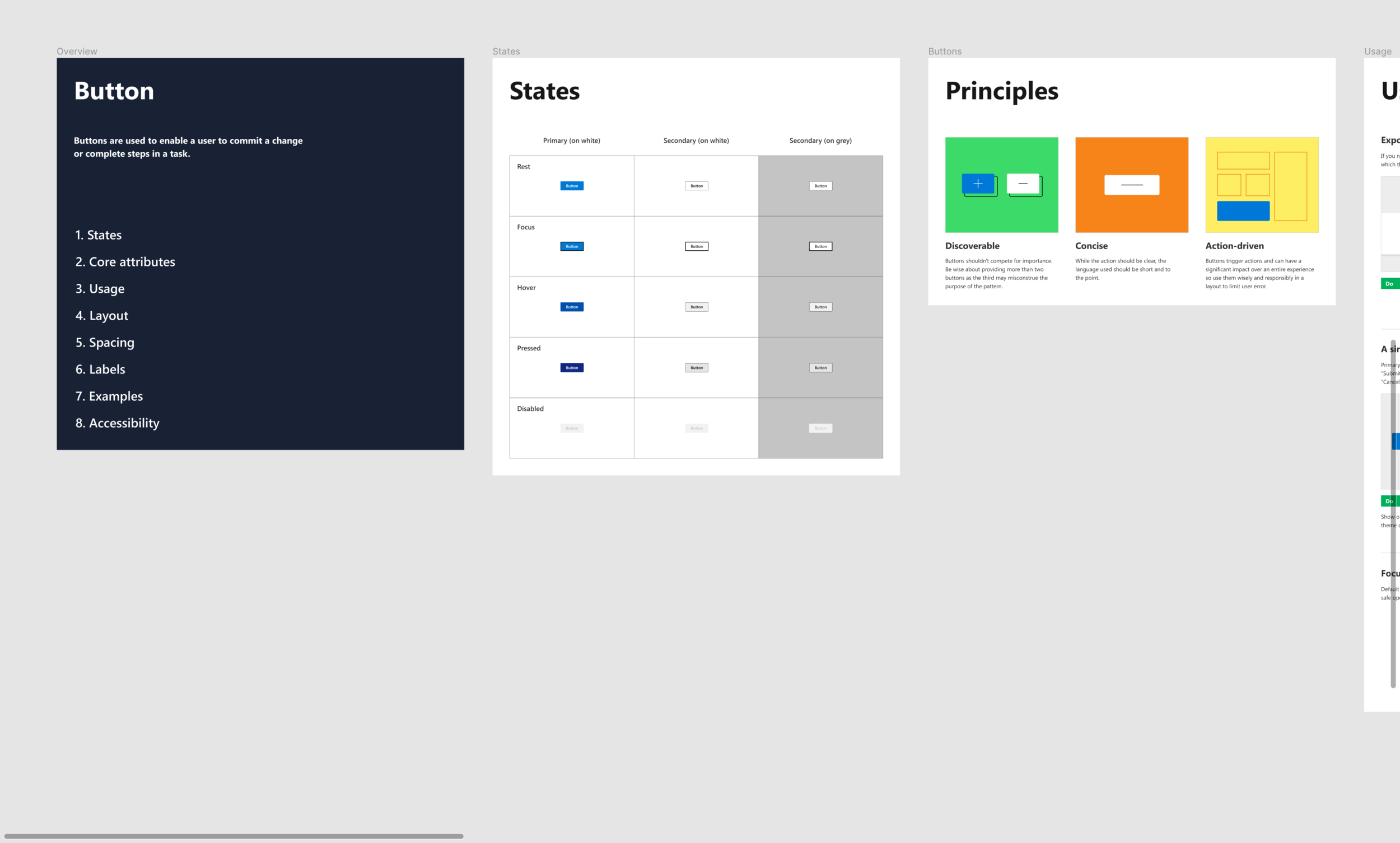
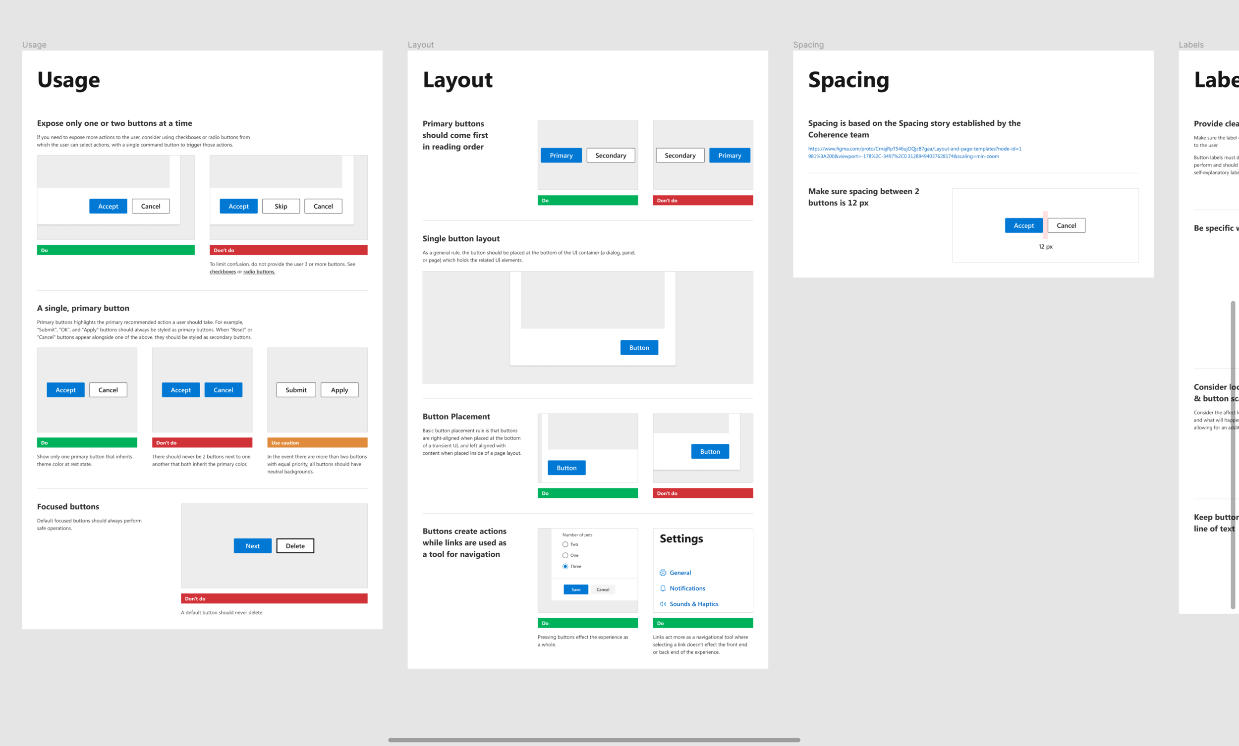
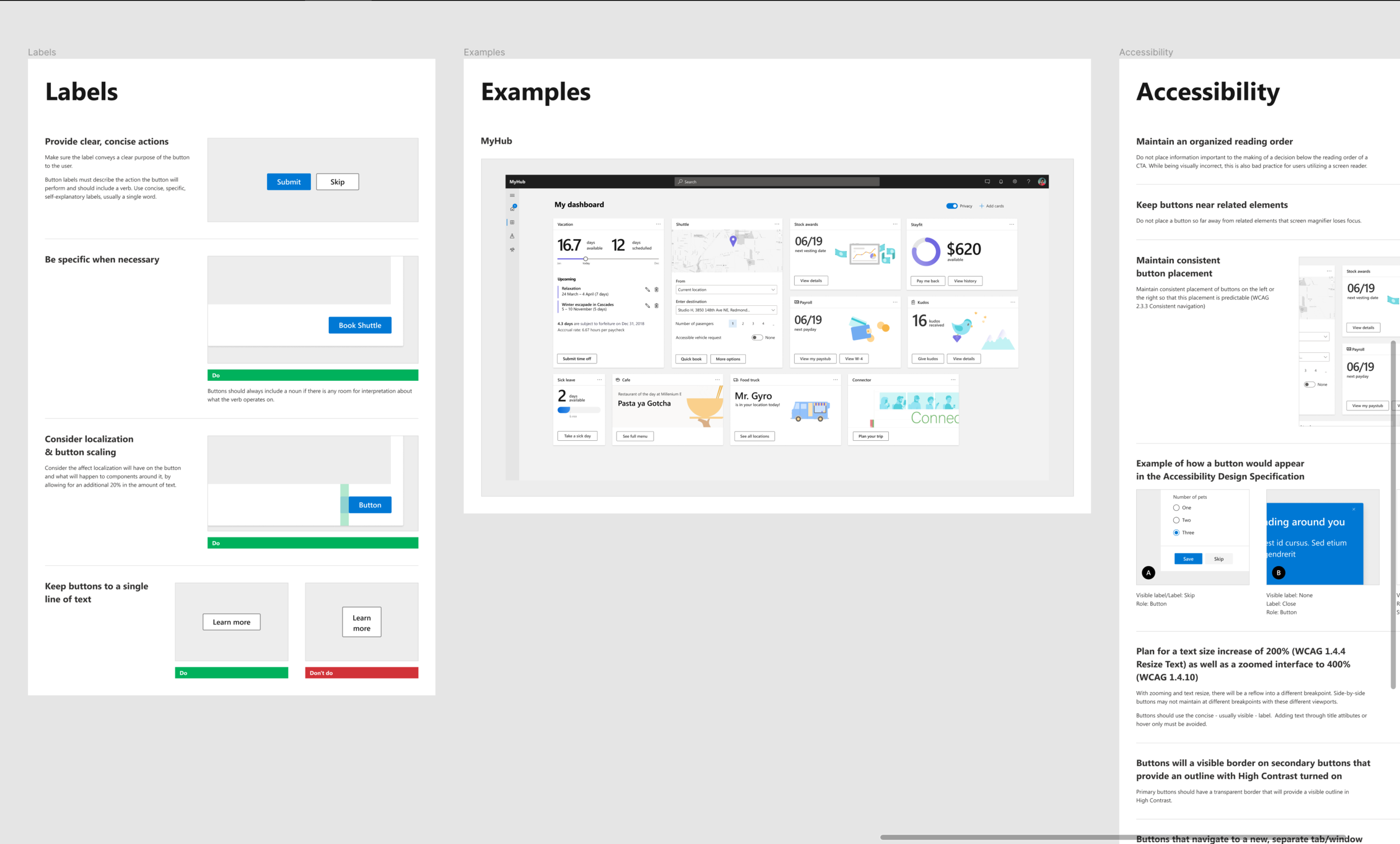
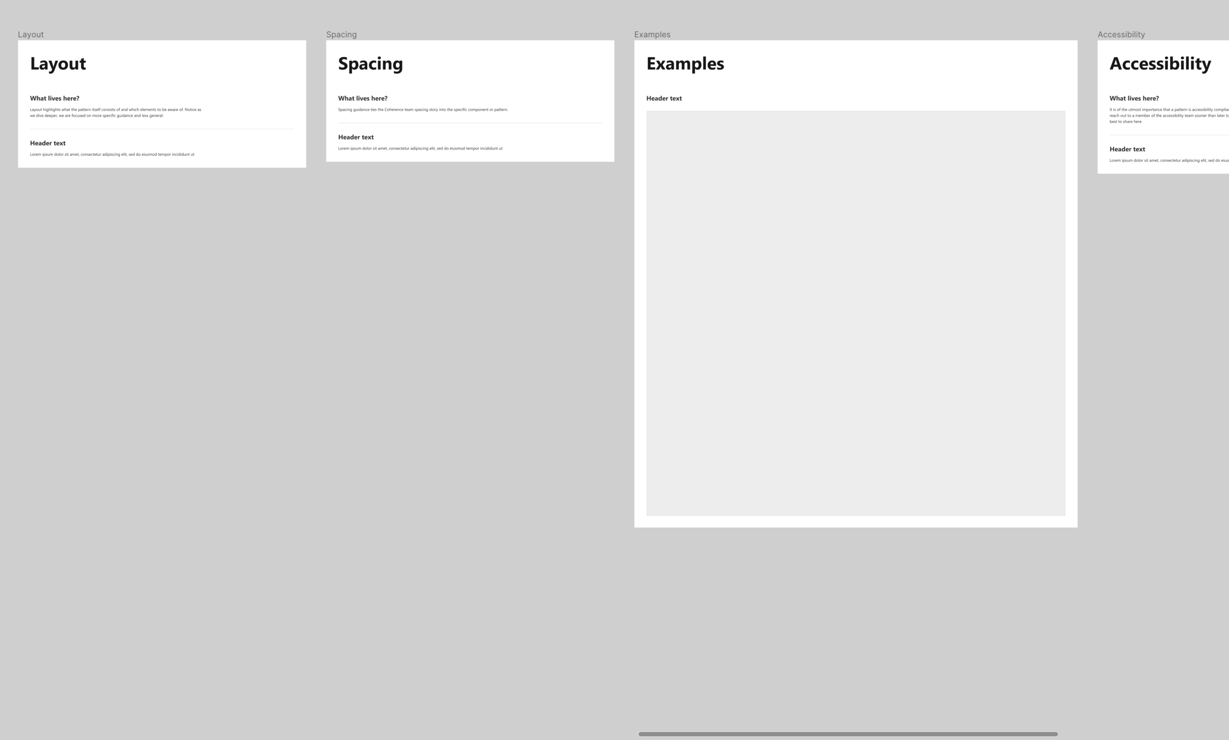
Each file begins with a cover page that illustrates what exists within each file. The components within each of these files needed in depth instruction on how they should each be used. The order by which we present guidance orders from broad to specific. We begin broad by communicating simple principles around each component so to ease potential non-designers in. I created guidance around the usage of simple components such as a button as well as complex patterns such as a notification panel or settings in desktop experiences.
The guidance I created was structured in a reusable format where other designers could essentially take building blocks that I created and piece them together to layout the basic structure of future components or patterns that need to be defined. This required me to build a “How to” file, a basic skeleton for structural layout and work closely with other teams in the studio to make sure that the structure I proposed was simple to use not only by myself but by others as well.

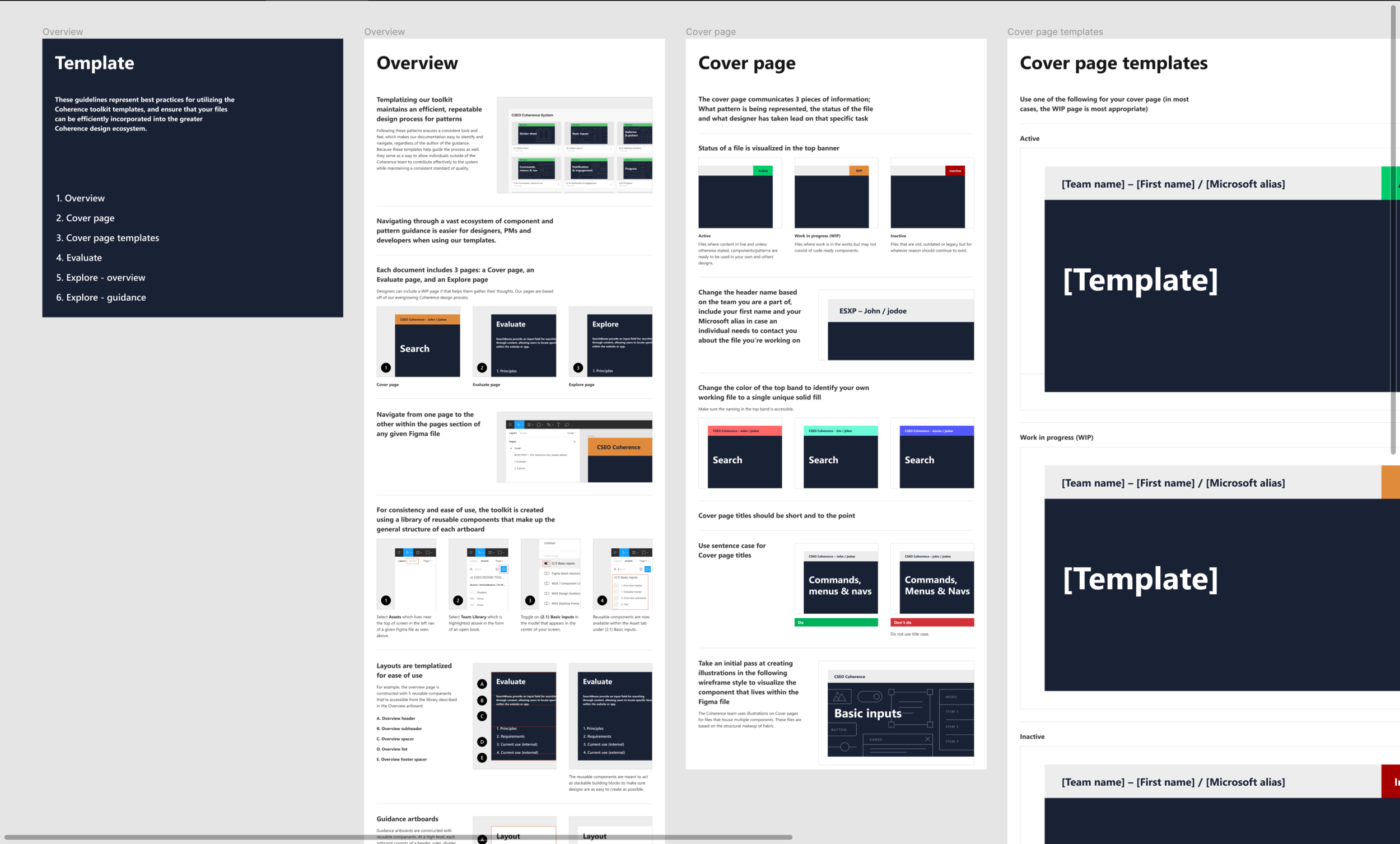
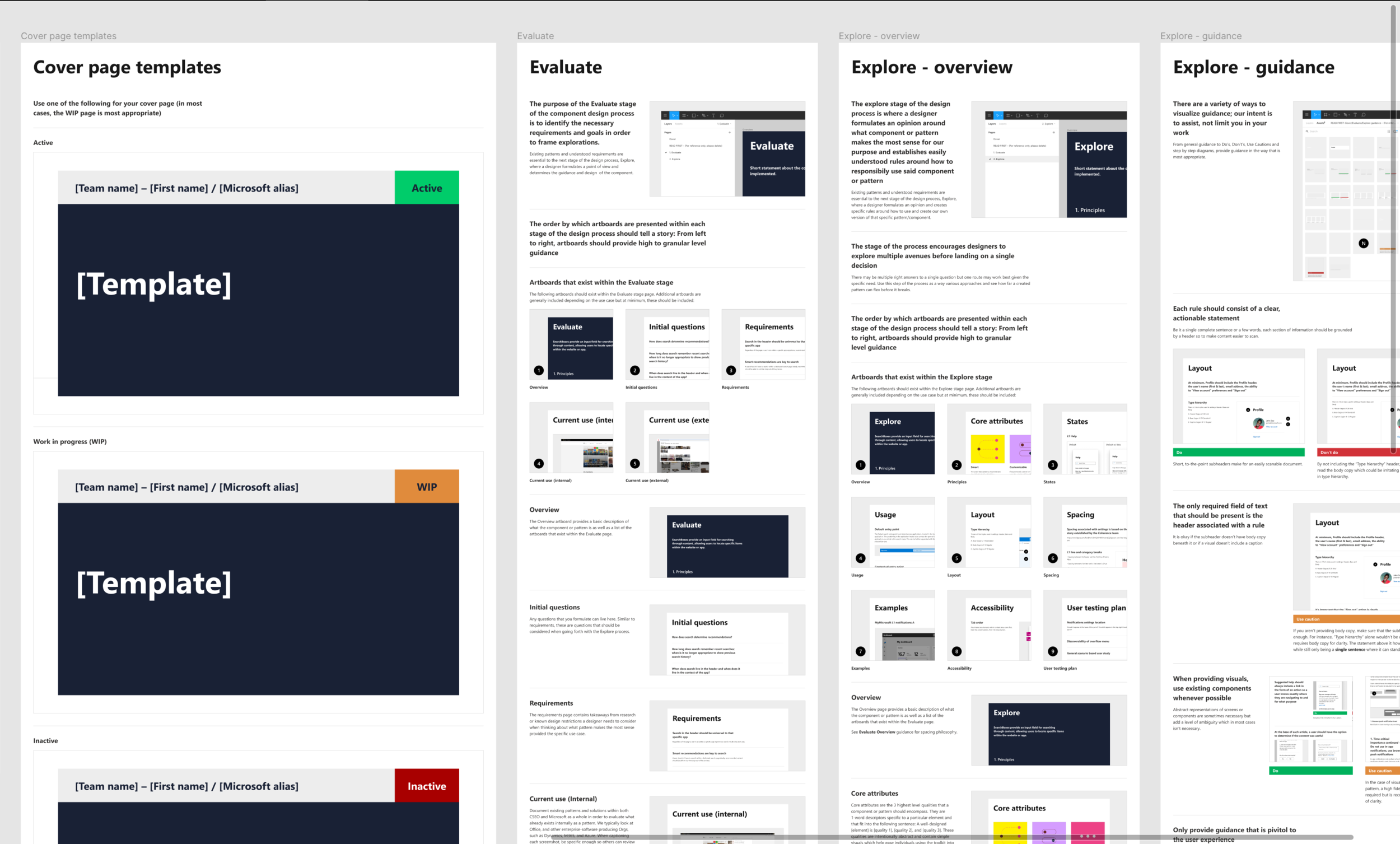
Notice in the image above with the “Toolkit template” cover image that the colored tag is orange while the rest of the banner is purple. For my projects, my personal color is purple so at a glance in a sea of other files I can immediately recognize my file from someone else’s. In that same image, notice the pages: READ FIRST, Evaluate, Explore WIP and Explore POV. In our design process, Evaluate is essentially the research phase where we determine general best practices for a given component or pattern, the requirements for these component on our specific teams and how Microsoft all up is using the component in other areas of the company. If it’s not a broken experience, we don’t want to fix it (Oftentimes unfortunately, what exists across Microsoft doesn’t embody design best practices). Explore WIP is where we take our research and begin conceptualizing approaches. The POV stage is the guidance portion where we create rules around a singular direction on how to use a given component or pattern.
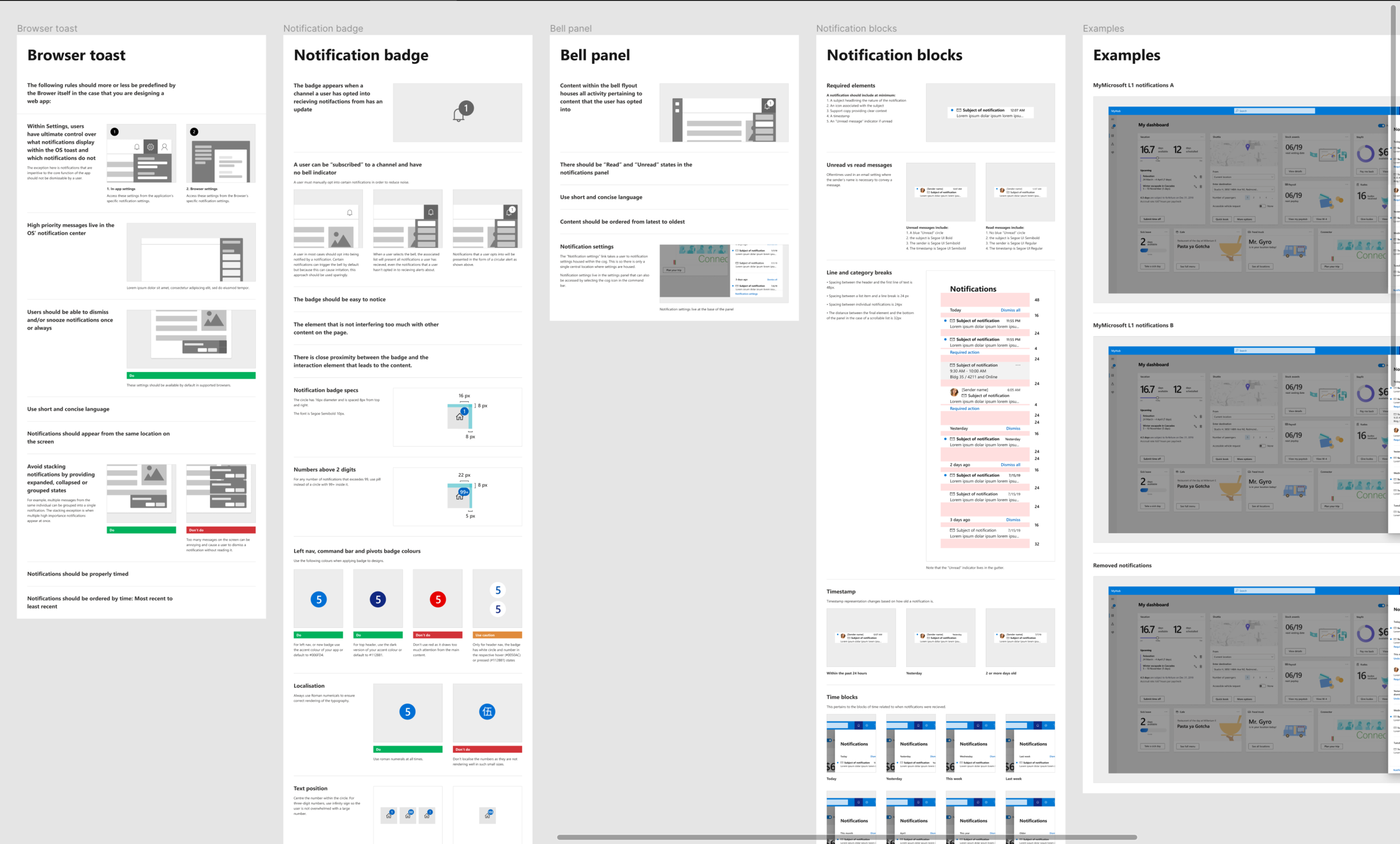
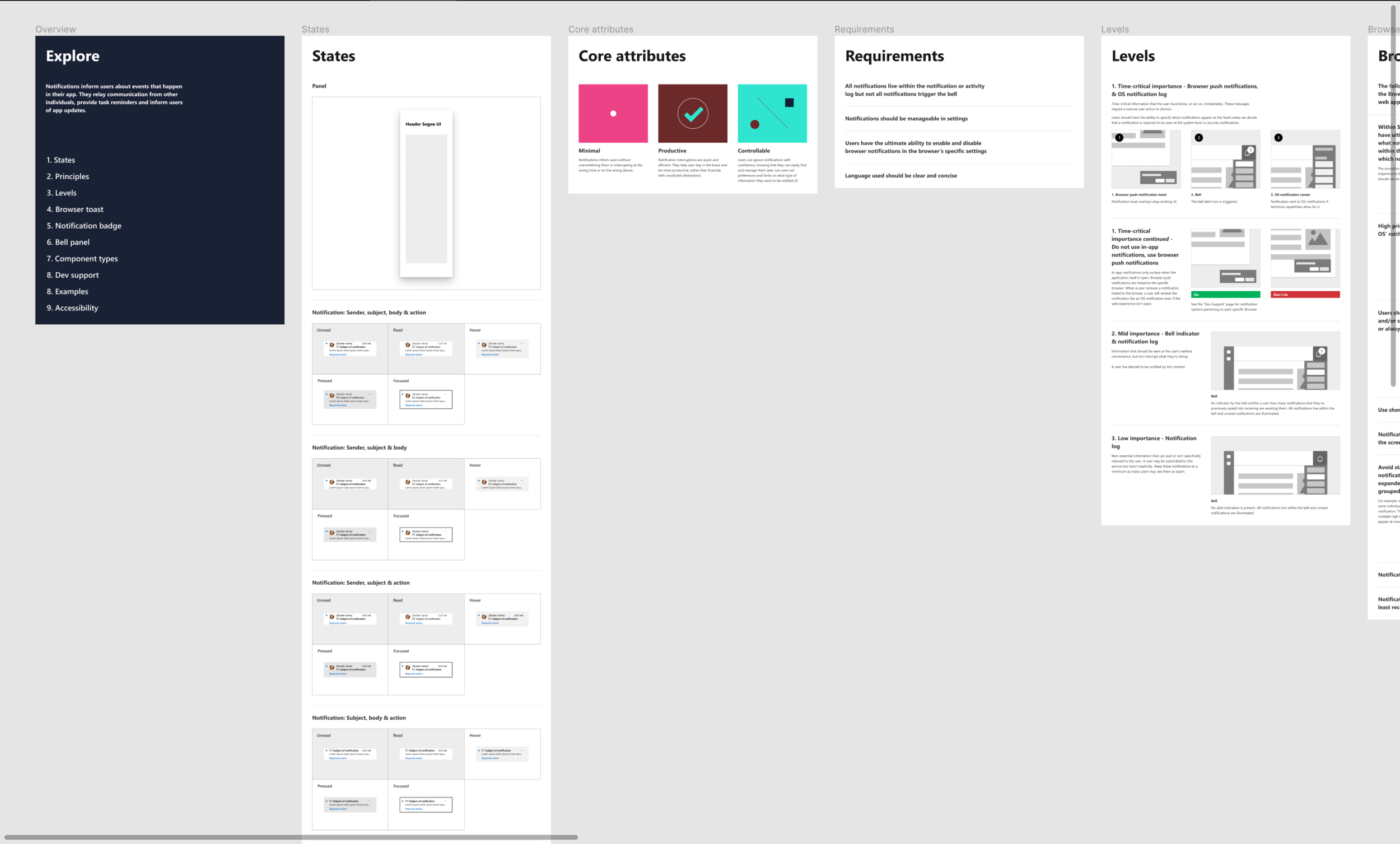
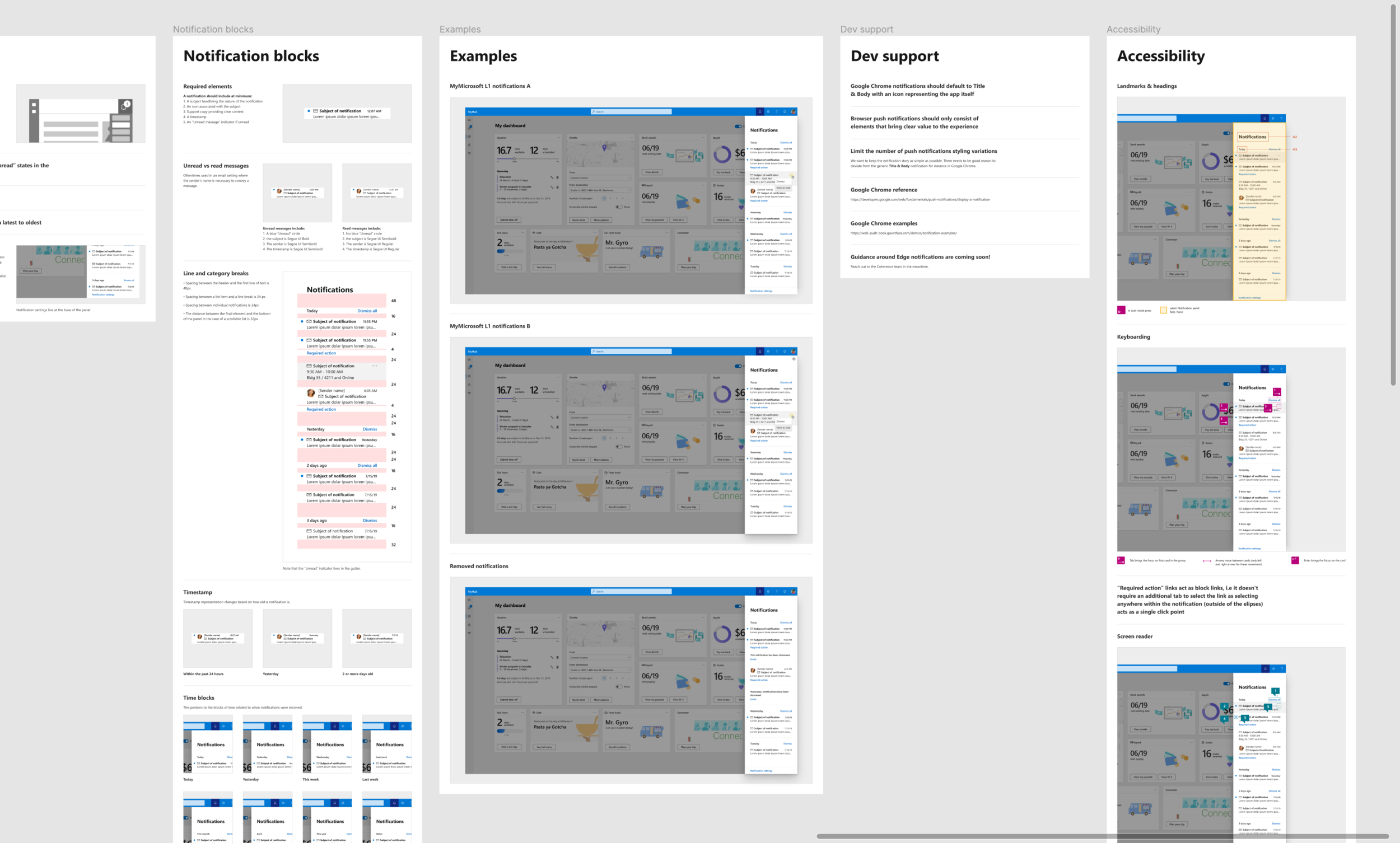
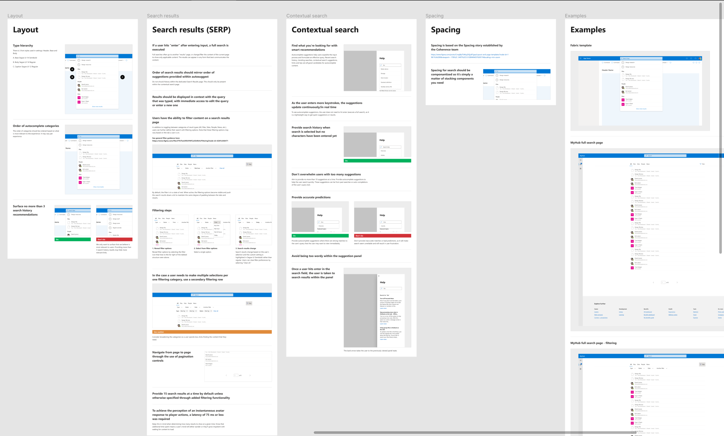
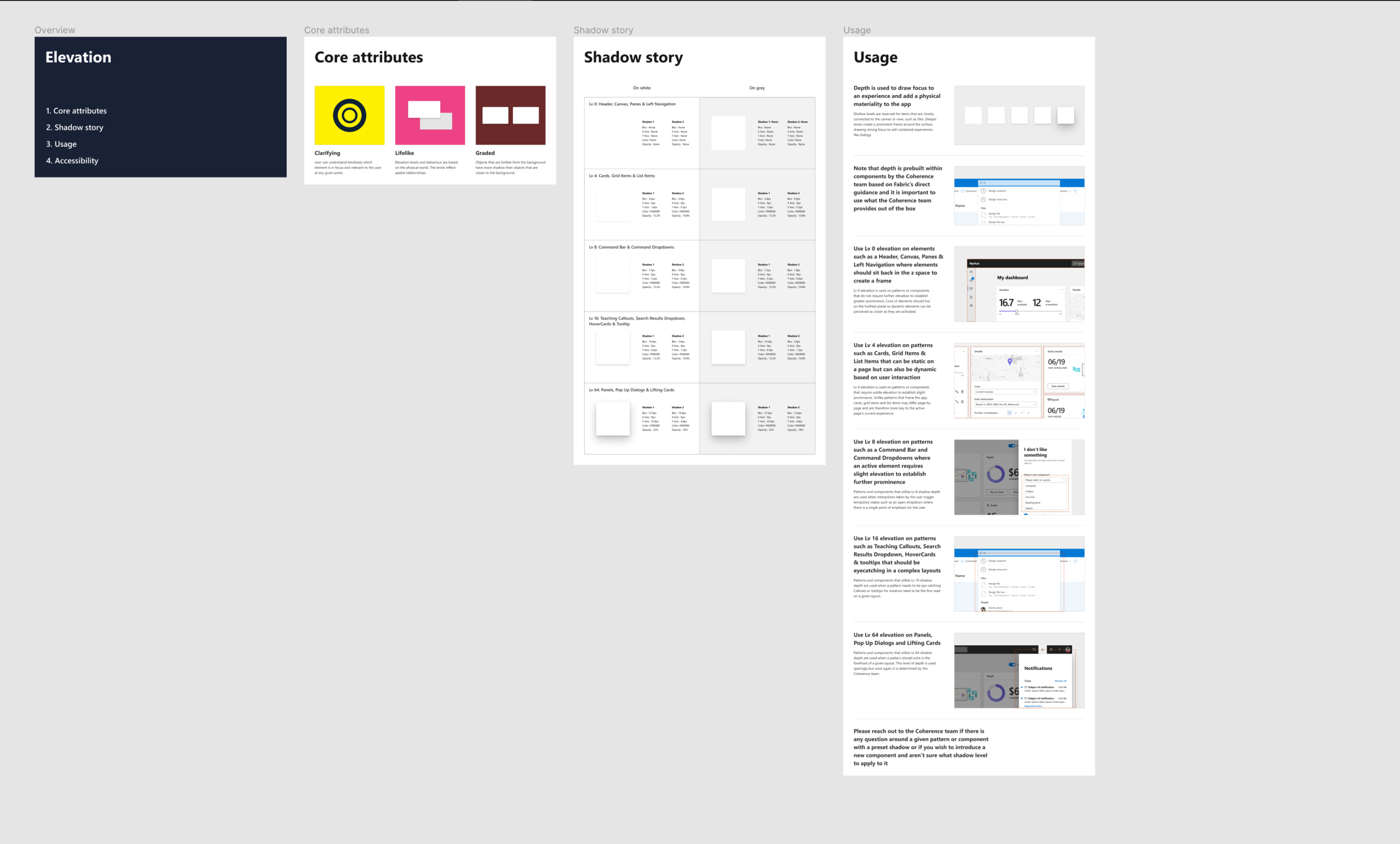

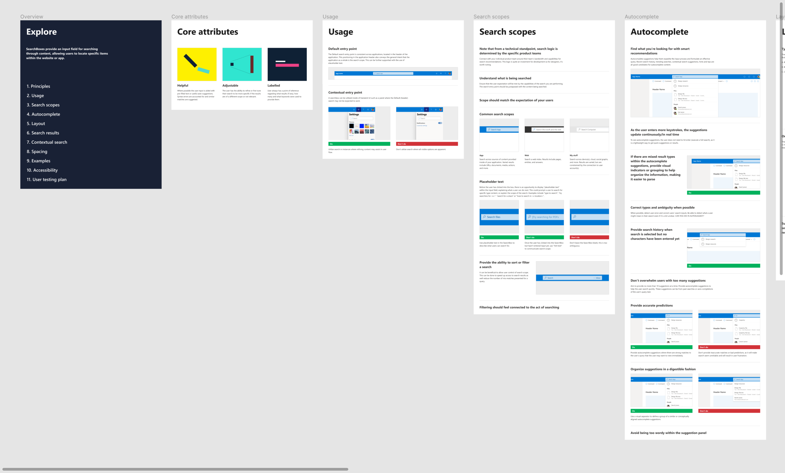
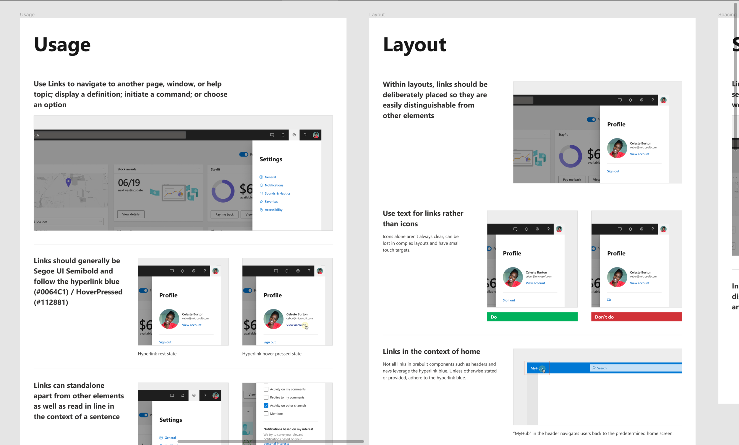
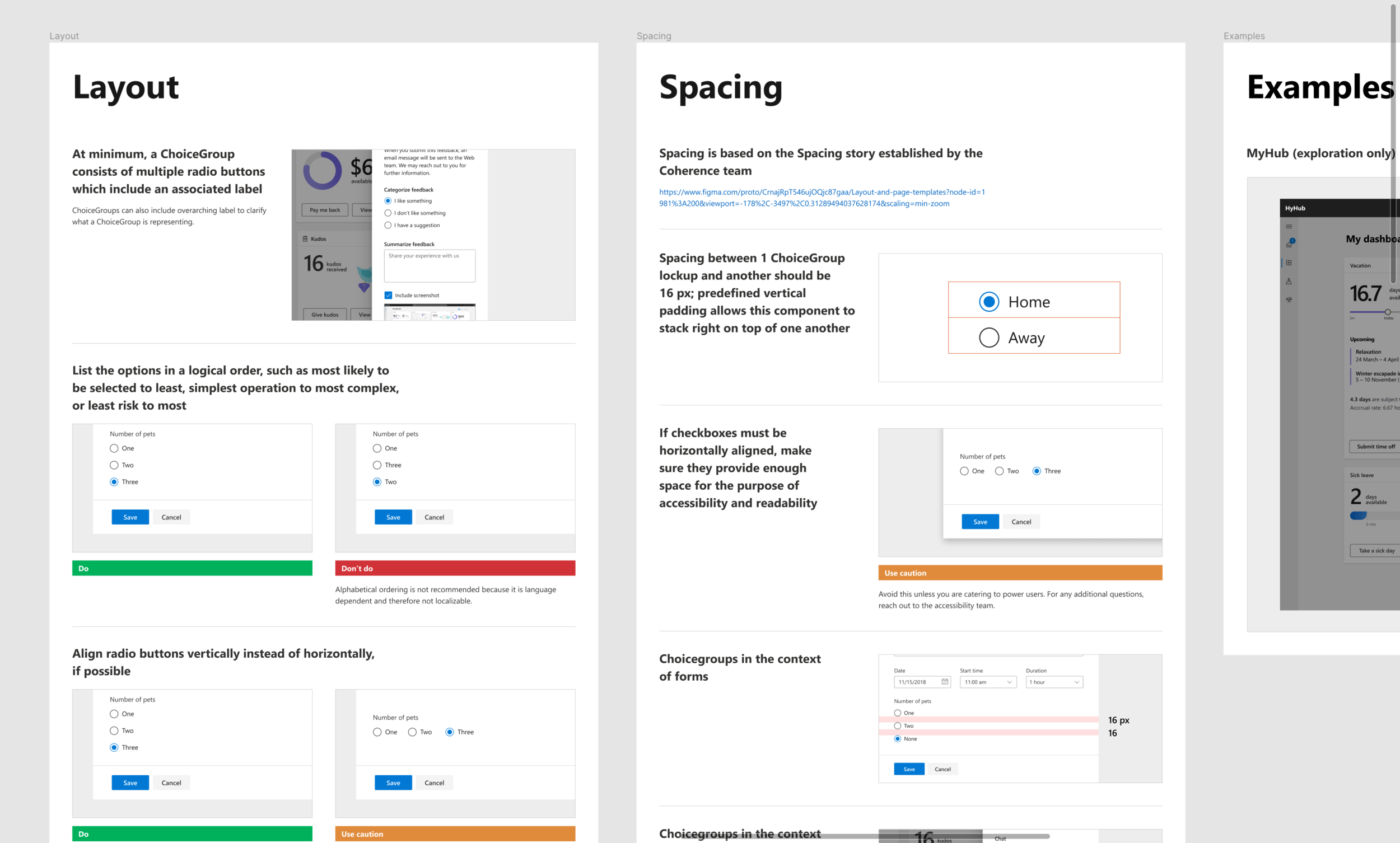
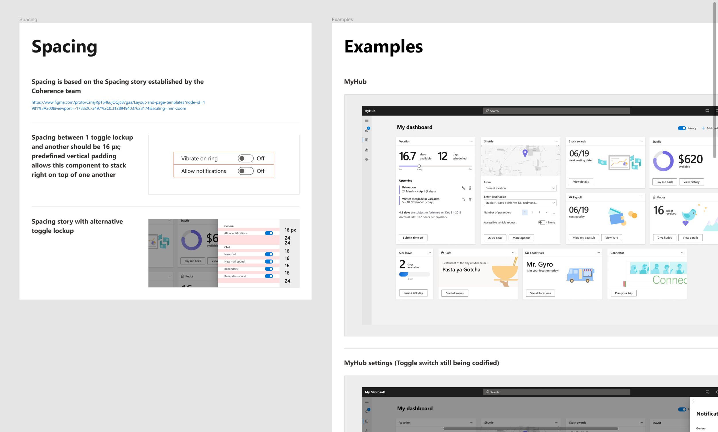
The screenshots above are only a fraction of guidance I’ve created for our toolkit. Working on the toolkit has been a team effort but I have been fortunate enough to create guidance for the majority of our components, styles and patterns. I’m not professionally trained as a copywriter but a large portion of the creation of the toolkit involved writing the guidance. The writing portion of the guidance was put largely on me which was great because it forced me to further support my design decisions in as simple terms as possible. Unfortunately, guidance such as this to the extent we’ve created it is extremely rare at Microsoft. Accessibility guidelines are provided across components and patterns. We work closely with members of the accessibility team and the user research team to ensure that the experiences we are providing are friendly to all types of users. Moving forward, our team hopes to continue expanding on guidance and act as a model across Microsoft as how designers should think about design to facilitate communication across teams and larger organizations.


