Burgerland
A Seattle-based burger truck needed a brand that stood apart from its Capitol Hill food truck competitor

Burgerland is a concept that my friends and I came up with in high school. There appeared to be a scarcity of burger food trucks on Capitol Hill, a region of Seattle that attracts youthful bar goers. While we had an idea of how the food truck would feel, we never explicitly outlined its visual characteristics.
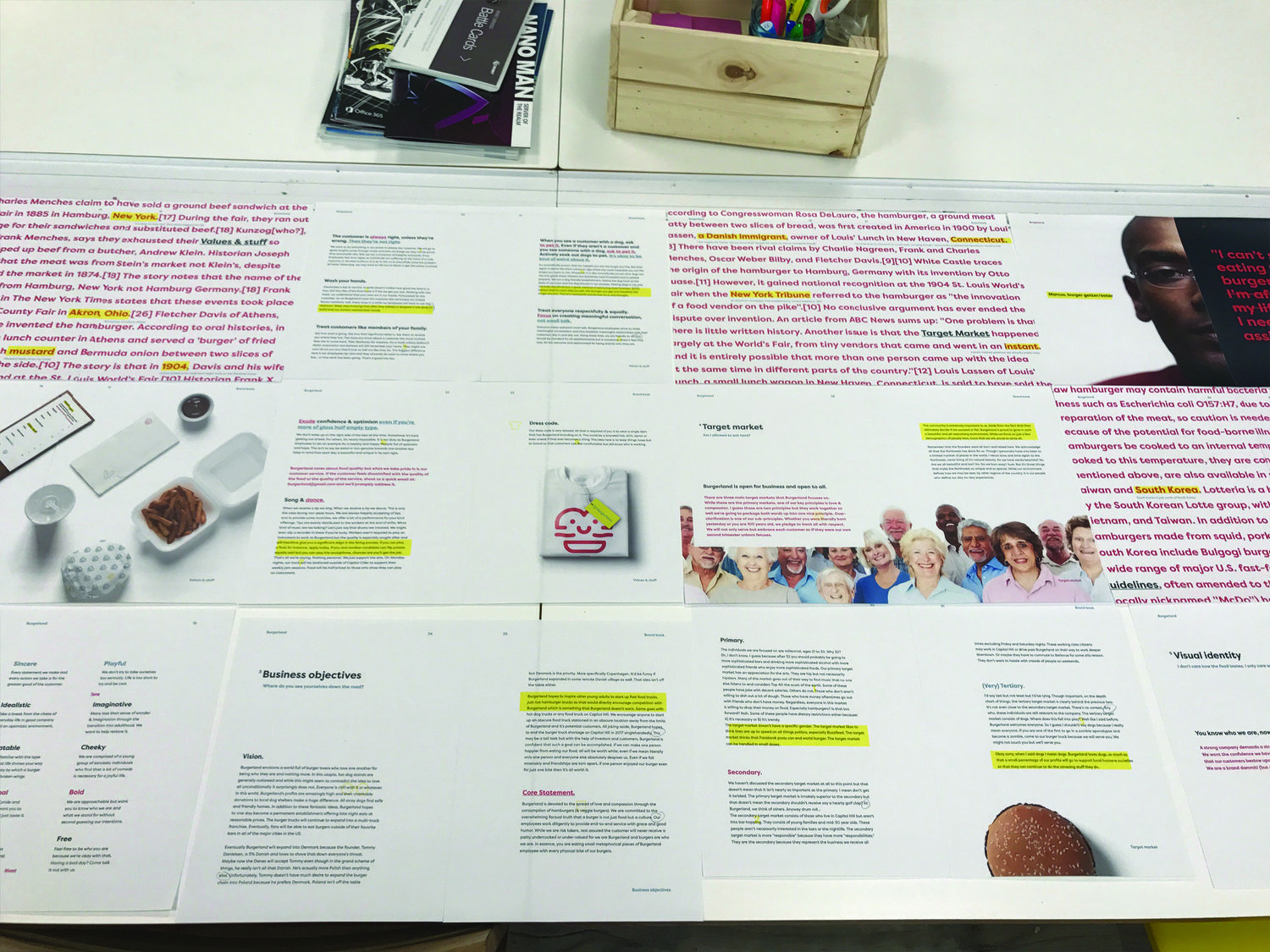
I took on the task of writing and designing a brand book for Burgerland. While the physical appearance of the company was clearly important, we also found it important to outline a system of values that drove our decision making. The company needed a personality.
Project
Branding & book design
Year
2017

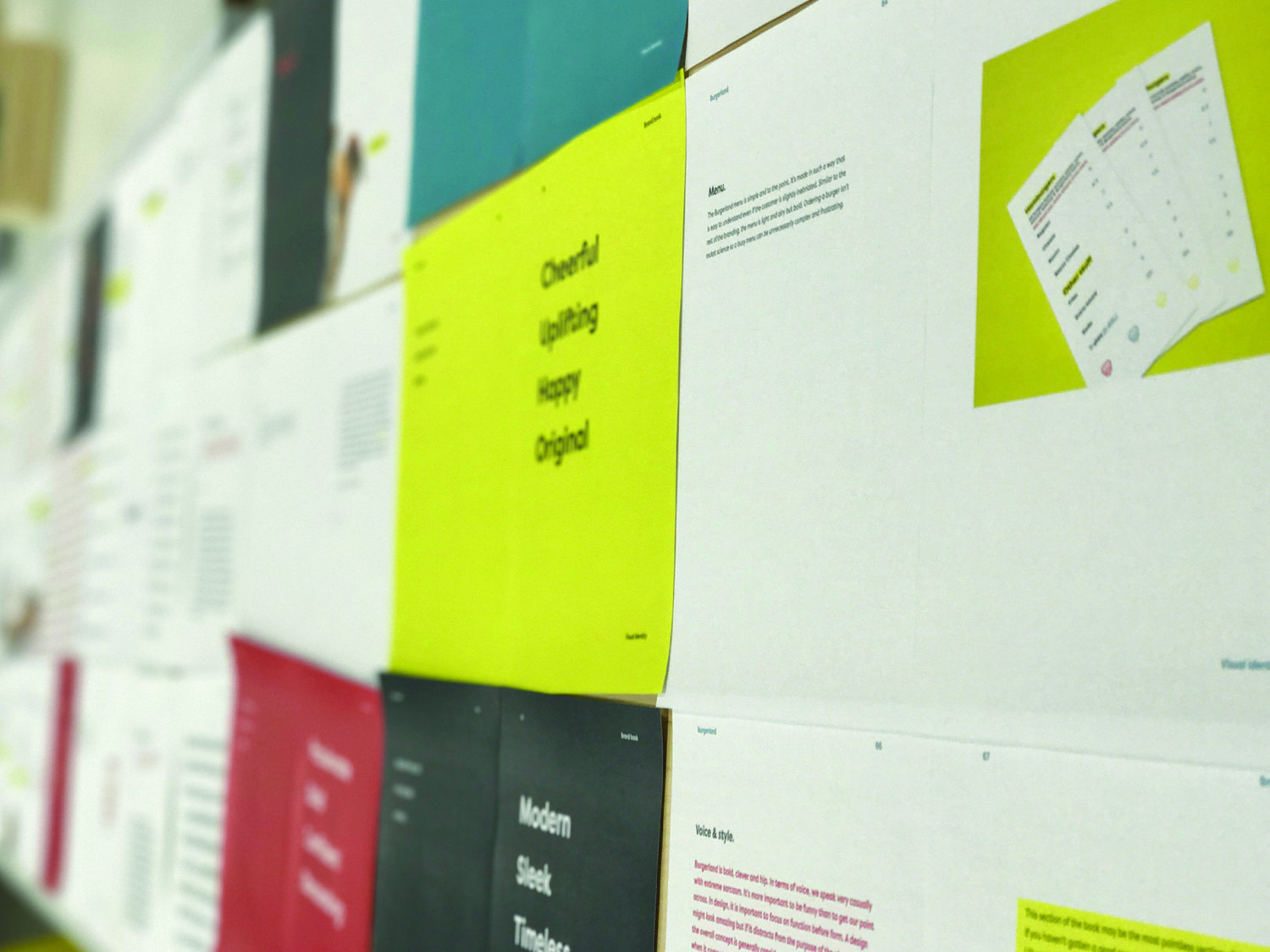
Pretty early on we wanted to create a logo that encapsulated our brand. We established our brands key pillars after a quick Brand Deck exercise. Burgerland’s mood is sincere, its tone is playful, its visual language is vibrant and its demeanor is laid-back. With every burger sold, our goal was to spread love and joy to others. The logo needed to directly represent that.

The color palette was a further extension of the personality established by the brand. We landed on incorporating red, yellow, baby blue and dark blue. Red is passionate, bold, confident and stimulating. Yellow is cheerful, happy, uplifting and original.


The bulk of this project revolved around the creation of a physical brand book that summed up Burgerland. The finished product was a 74 page book, printed and bound by Blurb. I did a number of test prints beforehand and that process can be seen below.
Each page was written, designed and laid out by me.