MyChart
MyChart’s app needed an update so users could find health resources better

MyChart is an app I use frequently for health related needs. The app today is clunky and difficult to navigate through. Users across the board rely on MyChart to communicate with health workers, know when appointments are coming up and medication info. The app includes many other helpful resources. Unfortunately, many of these resources are near impossible to discover.
Project
App design
Year
2021
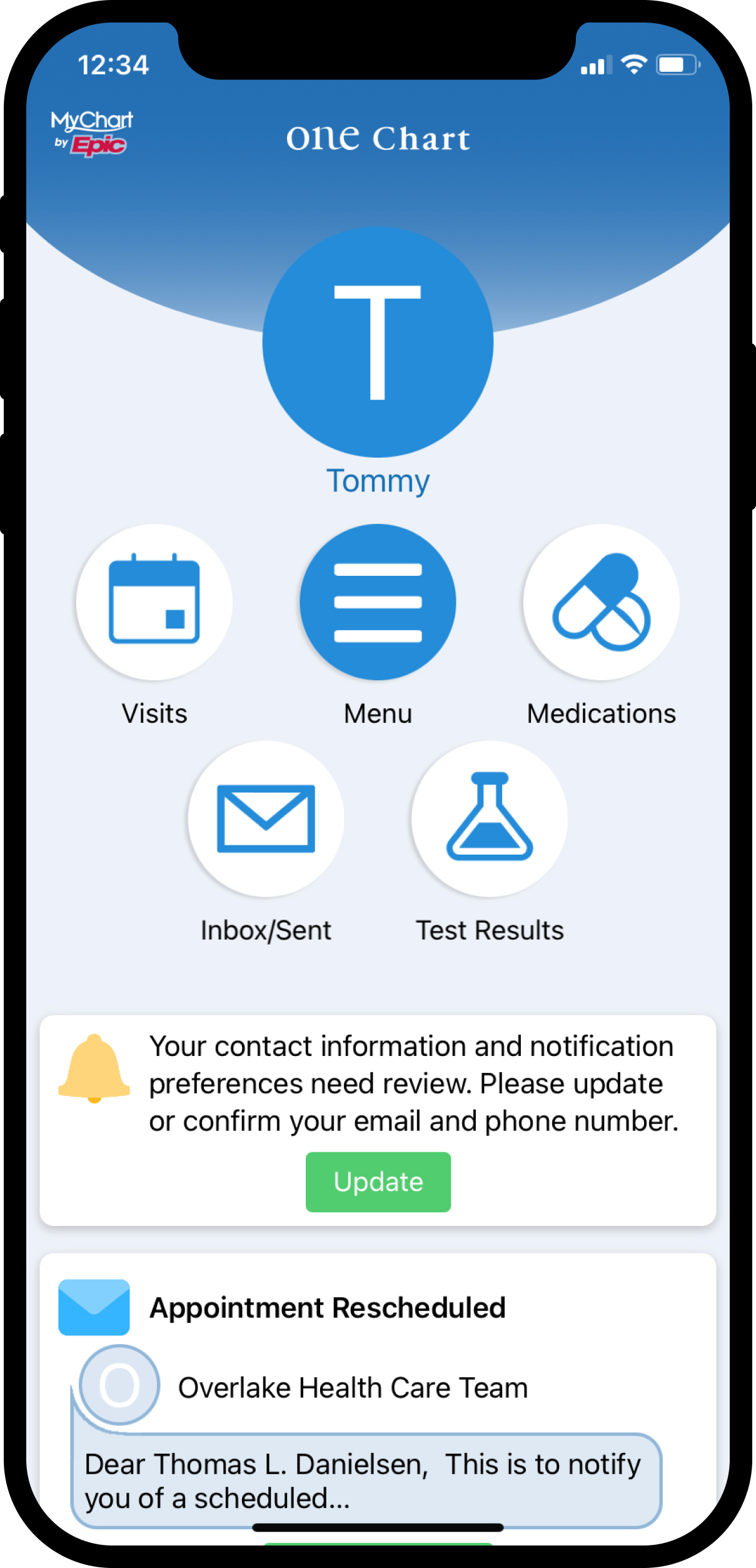
The MyChart as it stands today is rather confusing. While it calls out primary features, the nav is unorthodox and many features are hard to discover. The app also feels a bit sterile. Health related matters can oftentimes cause stress. As a result, the app should feel more welcoming and full of life.
With so much cognitive overload, the app leads to confusion and is overwhelming in nature. Consider the fact that this app is being used by individuals of all ages and abilities. It needs to be simpler.
Soft colors, friendly illustrations, clear actions and a simplified UI with the focus on home and messaging would go a long way.

A primary feature of the app is the ability to chat. As a result, it should feel modern, simple and familiar. Native iOS patterns were leveraged in order to help the app integrate with existing patterns. Notifications run through here since messages in app today exist in the form of a notification from a specific sender.
